How to draw scientific diagrams
by Chris Woodford. Last updated: September 20, 2022.
No-one's ever likely to mistake me for Michelangelo, but I have at least one thing in common with that famous Renaissance artist: both of us have used art to communicate important things to other people. In Michelangelo's case, it was stunning paintings and sculptures; my own contribution to art history has been far more mundane: over the last decade or two, I've had to produce dozens of diagrams to illustrate the books and web pages I've written about science and technology.
Much of the time I've had superb artists and illustrators to help: I've just roughed out a basic sketch and they've done all the clever stuff for me. Recently, since I've been writing more for the web, I've produced most of my own art as well, which means I've had to learn to draw scientific and technological things far better than ever before. That's been a real challenge, because I've never been good at art. Fortunately, scientific art is very different from real, artistic art and, even if you've as little artistic talent as me, you can still do a passable job of communicating your ideas if you use a decent computer graphics package. So what's the secret? Here are some of the tips I've picked up over the years that I'd like to share with you now.
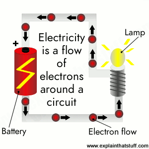
Artwork: How electricity works: I've redrawn this diagram at least four times in the last few years and this will probably be the final version. It was drawn large and scaled down to make the battery look good. I've put a big caption in the center of the picture and labeled the three key components. The drawback of doing this is that readers who don't use English, but who use auto-translation to read my pages in their own language, will see English text they may not understand. I discuss an easy way around this in point 6 below.
Sponsored links
1. Keep it simple
Once you've decided what you're going to draw (say, how a television works), strip down to the absolute essence of what you're trying to communicate (the process by which a broadcast signal arrives and is turned into a picture and sound by the circuits inside). If this is the kind of thing you're trying to explain, you don't need to show every single electronic component: just pick the handful of key bits that tell your story and forget everything else. Combine components and show them as bigger, cruder parts if you wish. Good how-it-works diagrams have maybe only a dozen distinct elements to them at most.
Remember that your entire explanation doesn't have to rest on this one artwork: you'll have text and you can add photos too to show finer details of how things appear in reality. If you're going to use photos and artworks together, it's best to choose the photos first so you can draw your artwork to relate to them in some way (you could copy key details from the photos, or use the same colors for parts that the photos show so your readers can relate the artwork directly to the photos without difficulty).
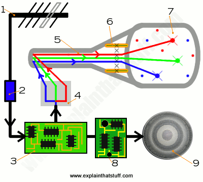
Artwork: How a television works: This diagram illustrates many of the principles I've set out in this article. It's ultra-simplified, there's no excess decoration, I've removed everything but the components I want to explain (fewer than 10 in total), I've arranged the internal parts in an order that makes sense to my explanation (taking lots of licence), I've made the artwork flow logically from top to bottom and from left to right, I've mixed photography (of the speaker) with drawing, and I've left the text off the artwork (in favor of numbers) so the captions will translate properly. It's no Michelangelo, but I think it does its job well.
2. Communicate not decorate
There's a great temptation to draw things in extreme detail so they look as realistic as possible, but there's usually no need: the fewer lines you use and the simpler you make things, the easier they are to understand. If you're drawing the drive mechanism of a car, and explaining how power gets from the engine to the wheels to make it go down the road, you don't need to draw any of the parts in any great detail. You can just draw the car wheels as circles, for example—you don't need to draw the nuts on the hubs or the tread on the tires!
"Communicate not decorate" is a lesson you'll learn quickly by browsing the artworks that inventors draw when they submit patent applications (legal records of inventions). With the help of a site like Google Patents, you can quickly find the original records of all kinds of famous inventions, from the Wright brothers' "flying machine" to George de Mestral's detailed description of VELCRO® (the hook-and-loop fabric fastener). It's well worth browsing through some of these patents to see how technical illustrators simplify complex mechanisms so they're easily understandable from a drawing. One of the biggest challenges these artists face is communicating incredible amounts of detail in a two dimensional, static, black-and-white picture. There is no room at all for decoration, which distracts from the explanation. When I'm using patent drawings on this website, I typically add color to make them easier to follow (and sometimes I animate them too). How do you add color without obliterating details? You add an extra layer to the artwork, fill in the colors in that new layer, and then reduce the layer's opacity (I find 20–40 percent works well) so the original black and white details "shine" through.
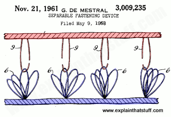
Artwork: George de Mestral's VELCRO® patent includes this very clear drawing showing how his invention works. The original is black and white, but I've added the color myself to make the explanation faster and clearer. It's important to note that the color is here to communicate, not decorate: the simple addition of two colors, to show up the two distinct parts of the VELCRO® fastening, makes all the difference. Artwork from US Patent 3,009,235: Separable fastening device courtesy US Patent and Trademark Office.
3. Take artistic (and scientific) licence
Painters often use what's called "artistic licence," which means they don't slavishly follow reality if they can make a better picture some other way. They might put in extra people, move trees, draw buildings in different places, and take all kinds of other liberties with reality to produce a more interesting composition. As a scientific artist, you should feel free to do exactly the same. Leave things out if they complicate what you're trying to communicate; add extra things in if they help. If it confuses to draw things exactly as they are, draw them a different way. Your number one priority is not to depict reality exactly as it is—you can use a photograph for that—but to help people understand something. Remember all the time that you are trying to communicate clearly; it's fine to bend the truth a little to make that happen.
David Macaulay, one of the greatest technical illustrators of the 20th century, made his name with the fantastic children's book The Way Things Work. The striking thing about David's approach in that book is the use of a kind of "retro" drawing style to illustrate even the most cutting edge technologies: a woolly mammoth from prehistory sits happily alongside body scanners, computer chips, and lasers. Why? Isn't that precisely what I just told you to avoid: decoration at the expense of communication? No, it's artistic licence! David's style makes mundane material more lively and compelling—so you spend time inspecting his drawings instead of just thinking "Well that's pretty dull" and turning the page. The drawings entice and engage you so the process of communication can begin. If you aspire to be any kind of technical artist or illustrator, David's work is definitely something to study.
4. Go with the flow
In the western world, we read pages of text from left to right (Arabic readers are used to their eyes working in the opposite direction) and from top to bottom. People naturally try to read diagrams the same way, starting on the left and moving to the right, and flowing from the top of the page to the bottom, so design your artworks that way if you possibly can. If you're laying out the parts of something, assume they'll be read left-to-right and top-to-bottom. If you're illustrating a sequence of things, arrange it in a logical order with the first item on the left, then the second item, and so on... working your way across to the right of the page.
5. Number in a logical order
You'll often find it helps if you number items on a diagram, especially if you're showing a definite sequence of things or lots of different parts. Again, if you're going to do this, make sure the numbers flow logically either from left to right, top to bottom, clockwise, or anticlockwise. Don't have the numbers jumping around all over the place (especially if there are lots of them). Readers don't want to have to keep scanning their eyes back and forth over the diagram to search for the next item: make it easy and less confusing by putting things in the order they expect.
6. Leave text off the artwork on web pages
Often you'll need to label a diagram with names of parts or short captions that explain what's going on. If you're preparing a diagram for a book, it's usually easiest to put the text on the diagram itself—and there's no real reason for not doing so. If you're producing an online diagram to illustrate a web page, there's something else to think about. If your website is like mine, a high proportion of your readers may be reading your pages not in English but auto-translated into their own language. If you write text on your artwork (as I've done in the top picture on this page), foreign language readers may not be able to understand it. The alternative (and one I've used on the other artworks shown here) is to put numbers on my pictures and then caption those numbers in the HTML text of the web page, in something like a numbered list. Then if the web page is auto-translated, the captions will be auto-translated too and readers will still be able to understand the artwork properly. The broader lesson here is to see things through your reader's eyes.
7. Explain in space... and time
Often you'll want to explain how something like a machine works in a sequence of distinct steps. Sometimes you can do that by drawing the parts inside in a particular way (not necessarily how they're arranged in reality), laying them out on the page (or the screen) from left to right and numbering them so you can describe what they do in the correct order. That's what I've done with the TV set and airbag artworks on this page. I've separated key parts in space to make a process clear in each case.
If you're drawing something for the web, there's also the option of making a simple animation—which amounts to separating parts in time as well as space. If you want to do this, the easiest way is to make an animated GIF, which is simply a series of individual frames (separate pictures) packaged into a conventional GIF file so they play in sequence as many times as you like.
Bear in mind that animated GIFs can turn into very large files, they'll take time to load, and they may slow down your pages. There are three things you can do to address that: try not to get carried away with too many frames (four is about the maximum you want); keep the size of the artwork as small as you can without sacrificing clarity; and use a relatively limited color palette (a small number of colors). If you find you've ended up with a very big GIF file, try reducing the number of colors from 256 (typically the default) to 128, 64, or 32. Find a value that preserves the quality without making the file size too big.
You can also use Flash for making animations, but it's more of a nuisance for users. You can't be certain that Flash files are supported on browsers and mobile devices and, with the development of HTML5, there's some doubt about how long Flash itself will survive. Animated GIFs have been around since the earliest days of the web; they're tried-and-tested and work on pretty much everything.
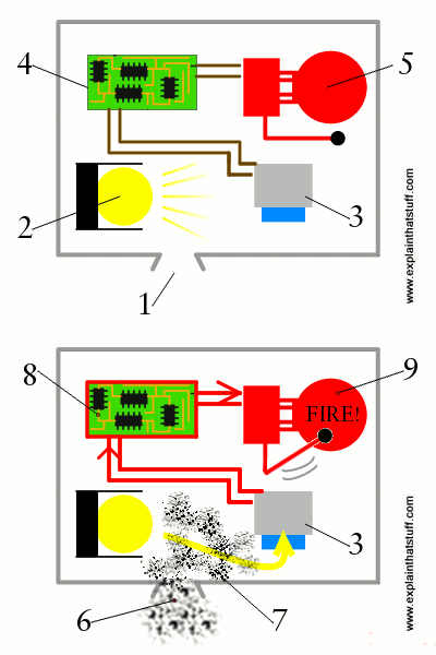
Animation: How a smoke detector works. This one uses two simple, alternating frames to communicate an idea that would be hard to depict without animation. In the first frame, I show the detector in its passive state; in the second frame, I show what happens when smoke enters and triggers the alarm. It's easy to make animations like this. You just draw one frame, save it and make a copy, modify that copy to make your second frame, and then combine the two frames in a single animated GIF. You can easily specify how many times the frames loop (here it's indefinitely) and the time lag between them. You can make animated GIFs in lots of different graphics packages, including the GIMP, which is what I use.
8. Scale your pictures according to your users
In the world of Michelangelo art, bigger is often better, but that doesn't always hold for scientific art. Generally you want diagrams that are big enough to see and understand. In books, page size and layout are the constraints you work with. On the screen, things are slightly different. Bear in mind that not everyone will have a screen the same size as yours. Increasingly, people are browsing websites on mobile devices, many of which have a maximum screen size of 320×480 pixels (though "phablets," which are somewhere between cellphones and tablets, are significantly bigger). On this website, we're now trying to keep all photos and artworks within these dimensions if we possibly can.
Designing materials for readers doesn't just mean seeing things through their eyes; it means testing things the way they'd use them too. In the case of web pages, be sure to try out your artworks on a range of different devices. Colors, for example, can vary quite a bit between different laptops and screen types. Do your artworks look equally good on smartphones, tablets, and desktops? If you're not lucky enough to own a closet full of computers, you can test your pages using mobile device emulators with a web browser such as Chrome (Chromium on Linux). Look under "More Tools" and "Developer Tools" and you'll find a huge set of emulators that let you test any web page on a wide range of emulated devices, from iPods and iPads to Kindles and Blackberrys.
Bear in mind that it's not just the basic pixel dimensions of an artwork that affect how it will look on a particular device: the aspect ratio and resolution of the device itself are also very important. If you find it confusing to get your head around all this stuff, Google has published two excellent introductions that I can recommend: Image Optimization and The Picture Element.
9. Beat your poor artistic skills
Picture size is also helpful if, like me, you're a clumsy artist. I find I always know what to draw, but actually translating what's in my mind into a nice-looking picture on the screen is quite difficult because I don't have enough skill with a mouse.
Fortunately, there is a solution. First, figure out the final size of the artwork you want (say it's 300×300 pixels). Then, instead of making your "canvas" that size to start with, make it at least twice as big (or three times as big if you can). Draw your picture so everything is double or triple size and then, when it's finished, scale it down to 300×300 or whatever. You'll be amazed how much more professional it looks. Your wiggly, pixelated lines will all look far sharper and better drawn. Bear in mind that lines will get thinner as you scale a picture down so you may need to use a bigger "brush" size than you would normally. Also, text may blur as you scale down so you may want to add in any text or numbering after the scaling operation, not before.
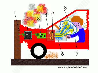
Artwork: How an airbag works: I'm really pleased with how this little drawing turned out. The final artwork is 400×300 pixels, but I drew it about three times the size (so the original filled my screen) and scaled it down. Overall, the effect is far better than if I'd drawn at 400×300 to start with. Not everything worked out, though: after I scaled down, the circuit (3) became too blurred to make out properly, so I had to redraw it. Bear in mind that anything finely detailed will take up a half, a third, or a quarter as many pixels after the scaling process, which could make it difficult to see. Experiment with scaling first so you know what will work and what won't before wasting your time on elaborate detail.
Another good trick for so-so artists is to mix photography with drawn artworks, as I have in the TV picture up above. If you need to illustrate bits of something you can't draw, find copyright-free photos of them online (or even take your own photos) and cut and paste into your artwork as necessary. I took photos of the speaker and circuits because I didn't think I could draw them well.
10. Use pullouts instead of cutaways or explosions
If you're drawing technological things, like machines, you often need to show bits that are hidden away out of view. A really skillful artist can do this with a cutaway (a composite drawing in which part of the exterior is removed to show what's lurking behind) or an exploded diagram (where the parts inside something are separated in a very logical way that keeps a suggestion of how they fit together). Cutaways and explosions are very demanding and time-consuming for even skilled artists to draw, but again there's a solution—in the form of pullouts.
A pullout is simply a detailed, magnified drawing of one part of another drawing that you place on top with lines to show what it relates to. (It's a bit like holding a magnifying glass over part of your main drawing.) One approach is to take a photo of the object you want to illustrate and draw a large circle on some part of it where you can safely cover what's underneath. Inside the circle, draw a simple artwork illustrating some key detail of what's happening inside the object. Then draw two lines from the outside edge of the circle that meet at the point on the object where the action you've drawn is happening. (Remember that you can draw your diagram in a very large circle to begin with and then scale it down to size later.)
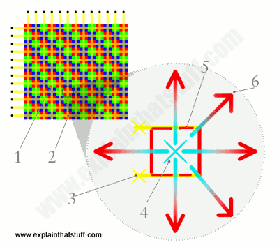
Artwork: How a plasma TV works. Here I'm using a pullout (the grey circle on the right) to show what happens inside one pixel of a plasma TV screen (the colored grid on the top left).
About the author
Chris Woodford is the author and editor of dozens of science and technology books for adults and children, including DK's worldwide bestselling Cool Stuff series and Atoms Under the Floorboards, which won the American Institute of Physics Science Writing award in 2016. You can hire him to write books, articles, scripts, corporate copy, and more via his website chriswoodford.com.
